title: "How I Built an Email Capture Popup That Works Across 3 Websites" slug: email-capture-popup seo_keyword: "reusable React components" meta_description: "Reusable React components: one popup, 3 websites, 3 brand configs. Props-driven email capture with 4 trigger types and analytics built in." og_description: "One popup component, three branded sites, real conversion numbers. How props-driven architecture turned a single React component into a cross-site email capture system with brand-specific triggers, suppression, and Beehiiv integration." cluster: infrastructure-buildlogs author: Victor status: published published_date: 2026-03-26 read_time_minutes: 14 description: "How I Built an Email Capture Popup That Works Across 3 Websites" domain: steepworks type: article updated: 2026-03-26
How I Built an Email Capture Popup That Works Across 3 Websites
By Victor Sowers | STEEPWORKS
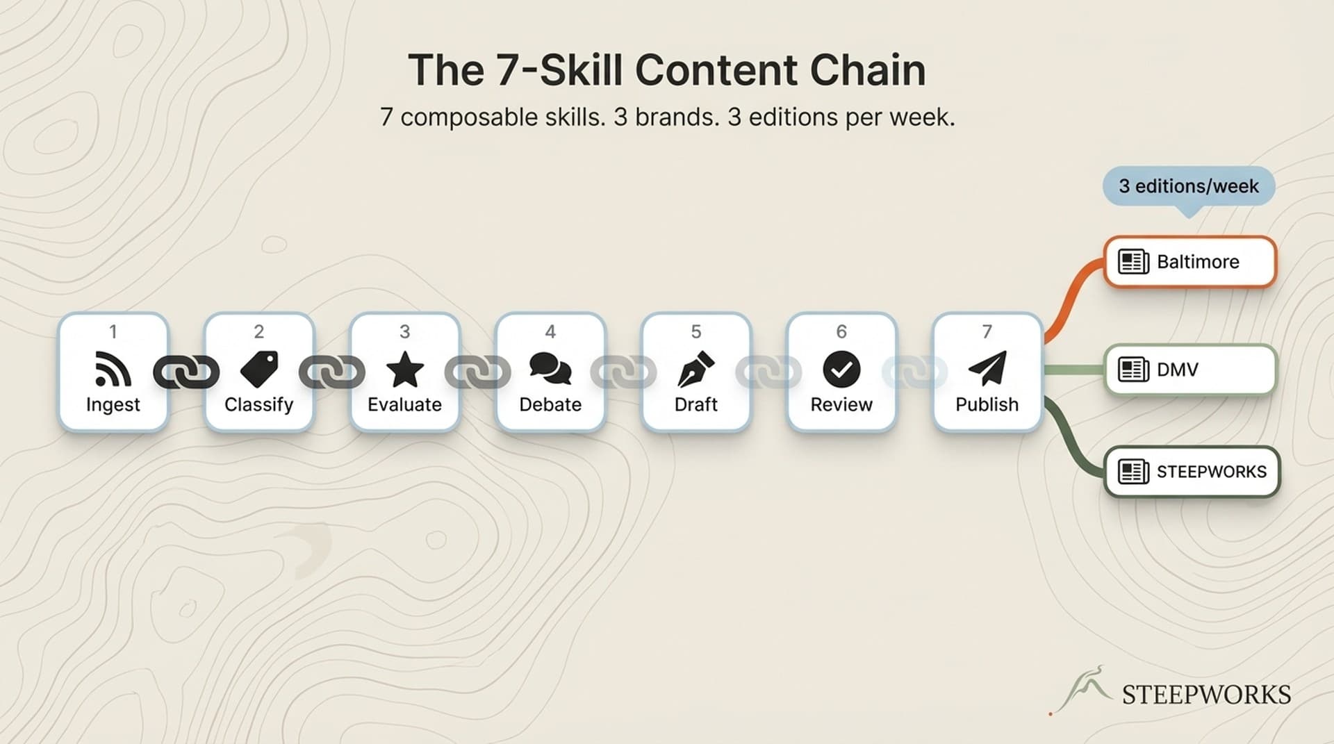
This is a buildlog about deploying one reusable React component across three branded websites. The popup is the case study. The multi-site component architecture is what you'll take away.
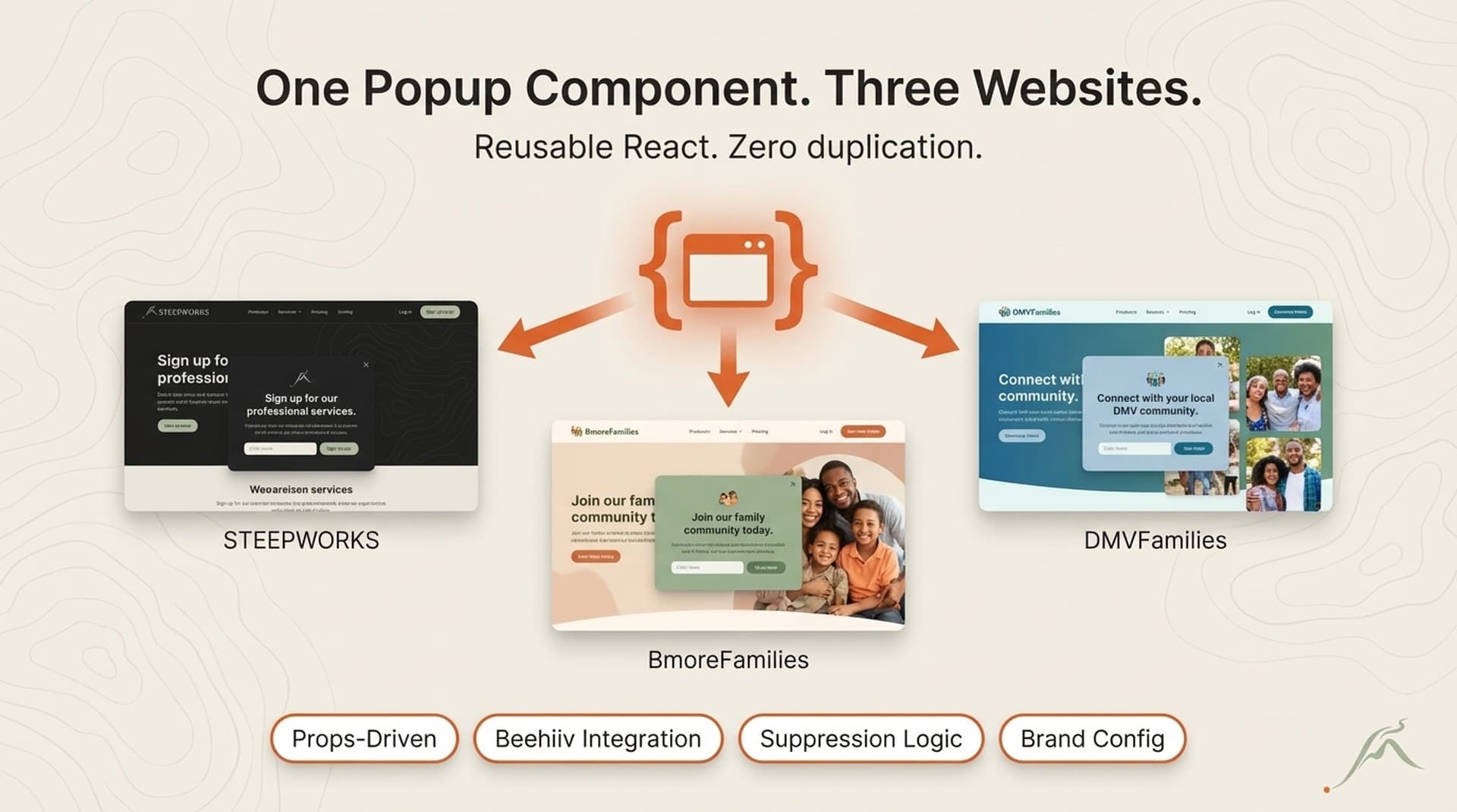
I run three websites — STEEPWORKS (B2B GTM insights), BmoreFamilies (Baltimore family events), and DMVFamilies (DMV family events). Each needs email capture. Each has different branding, different copy, different newsletter audiences, and different Beehiiv publication targets. The keyword I keep coming back to when people ask how this works: reusable React components. Not a library. Not a design system. One component, three config files, zero duplication of behavior logic.
Before I built this, I was maintaining three separate popup implementations. Two were slightly broken — one had a stale localStorage key that never expired, one had a timing bug that fired the popup on mobile before the page finished rendering. The third one worked but had hardcoded copy I kept forgetting to update. Three codebases, three bug surfaces, three places to remember to make the same change.
Omnisend's analysis of 1.24 billion popup displays puts the average email capture popup at a 2.1% conversion rate. Even small improvements to that number compound when you're running three sites. But the improvement I was after wasn't a higher conversion rate on one site — it was eliminating the drift between three implementations so I could iterate on one component and have the improvement deploy everywhere simultaneously.
This same approach works for any component you deploy across properties — CTAs, headers, pricing cards, testimonial blocks. The popup is where I learned the pattern. The sections that follow show how it works in production.
The Component Architecture — Props Over Hardcoding
The design principle is simple: everything that varies between brands lives in props. Everything that stays the same lives in the component.
Here's what varies across my three sites:
- Brand name and tagline. STEEPWORKS says "Curated Stories on AI in GTM." BmoreFamilies says "This Week's Best Family Events in Baltimore." DMVFamilies says "This Week's Best Family Events in DC."
- CTA copy. "Subscribe — it's free" for the B2B audience. "Send Me the Weekly Picks" for the consumer sites.
- Trigger configuration. STEEPWORKS fires after 18 seconds (B2B readers skim slower, shorter pages). BmoreFamilies and DMVFamilies fire after 10 seconds (event browsers move fast through listings).
- API route. Each site has its own
/api/subscribeor/api/newsletter/subscribeendpoint routing to its own Beehiiv publication. - Path suppression. STEEPWORKS suppresses on
/newsletter. BmoreFamilies and DMVFamilies suppress on both/subscribeand/newsletter— those pages already have inline signup forms. - Analytics callback. STEEPWORKS uses a custom
pushEvent()function. The family sites push towindow.dataLayerfor GTM. - Subheadline copy. BmoreFamilies references "400+ sources." DMVFamilies references "80+ sources across the DMV." Different markets, different proof points.
Here's what stays the same across all three:
- Popup container, overlay, and z-index management
- Animation and visibility state machine
- Form validation (email format)
- Beehiiv API integration pattern
- Multi-trigger engine (exit intent, scroll depth, time delay, idle detection)
- Close behavior (X button, overlay click, Escape key)
- Suppression system (localStorage-based, brand-namespaced)
- Focus trap and ARIA attributes for accessibility
- Success state with auto-close timer
- Responsive layout
The contract between "what varies" and "what doesn't" is a TypeScript interface — PopupConfig. It has 17 fields. The brand config file for each site is 40-50 lines. The component itself is 316 lines. The ratio matters: 40 lines of configuration controls 316 lines of behavior. That's the leverage.
What it feels like to maintain: Changing the popup across all three sites means editing the component file once, then updating the brand config in each site's config file. Three files touched total. When I adjusted the dismiss timeout from 3 days to 7 days, the change went live on all three sites in under 10 minutes. When I added idle detection as a fourth trigger type, I wrote the logic once in usePopupTriggers and added idleDetection: { enabled: true, timeoutMs: 30_000 } to each config. Compare that to hunting through three separate popup implementations, each with its own localStorage key naming convention and dismiss logic.
Why props and not a theme context: Simplicity. Three sites don't warrant a full design system. Props keep each integration self-contained and readable. You open one config file and see every brand-specific decision in one place.
Why not publish to npm: These are my own sites. No versioning overhead needed. I copy the component directory and import the brand config. If I had 10+ sites, I'd extract to a package. At 3, the copy-and-configure approach is faster and more transparent.
The transferable pattern: The PopupConfig interface is the API contract between "component that does things" and "brand that has opinions." Any component you want to reuse across sites can follow this approach — define the props type first, then build the internals. The type IS the documentation of what varies.
Related: How I generated 1,000+ SEO pages from a Supabase database — same "one pattern, many outputs" philosophy applied to content instead of components.
Beehiiv Integration — From Form Submit to Subscriber
The form submits to a site-local API route that forwards to Beehiiv's subscription endpoint. Each brand passes its own publication ID through the API route, so the same form handler routes subscribers to the correct newsletter list.
How the integration works:
Each site has an API route (/api/subscribe or /api/newsletter/subscribe) that accepts POST { email: string }. The route reads the Beehiiv publication ID from an environment variable, constructs the subscription request, and forwards it to Beehiiv's API. The popup component doesn't know or care which Beehiiv publication it's targeting. It posts to the API route defined in its config. The routing is the server's job.
UTM parameters forward from the popup's analytics callback, capturing which site and which page the subscriber came from. When I look at a new subscriber in Beehiiv, I can see whether they converted on the homepage, an article page, or an event listing. That attribution comes free from the analytics events the component fires: popup_impression, popup_close, and popup_convert, each with the source_page path.
Double opt-in is configured at the Beehiiv publication level, not the component level. One less thing the component needs to know about.
What broke and how I fixed it:
CORS was the first issue. Posting directly to Beehiiv's API from three different domains meant configuring CORS headers for each origin, or proxying through each site's own API route. I went with the proxy approach — each site's API route handles the Beehiiv request server-side, which eliminates CORS entirely and keeps the Beehiiv API key out of client-side code.
Form state management was the second decision point. I considered Formik and React Hook Form. Both are built for forms with 10+ fields, validation schemas, and complex state trees. My form has one field: email. I used useState. One state variable for the email string, one for the form state (idle | loading | success | error), one for the error message. Six lines of state. The form libraries would have added 15KB of bundle weight to manage a single text input.
Rate limiting hasn't been an issue at current traffic volumes. Each site hits Beehiiv independently through its own API route — no shared bottleneck. If any single site scales to the point where Beehiiv's rate limits matter, I'll add a queue. Not before.
The transferable pattern: Any third-party integration that varies per brand — analytics IDs, CRM endpoints, payment processor keys — can be parameterized the same way. The publication ID is just a string in an environment variable. So is a Stripe price ID or a HubSpot portal ID. The component doesn't need to know what the string means. It just passes it through.
Reference: Beehiiv's email capture documentation covers the official integration approach.
Why the "Don't Show" Logic Is Half the Code
The popup is useless if it fires at the wrong time. But it's actively harmful if it fires when it shouldn't. The suppression logic accounts for 65 lines of dedicated hook code — a file called usePopupGate that I think about more than the popup UI itself. It's half the behavioral code and 80% of the user experience. (Claude for operators)
The Trigger System — When to Show
Four triggers, first-to-fire semantics. The moment any one fires, all listeners clean up. No double-firing, no race conditions. (See also: quality gate)
- Exit intent (desktop only). Mouse leaves the viewport top. Classic pattern. Doesn't work on mobile, so the other triggers carry mobile alone. (See also: anti slop)
- Scroll depth. Configurable per brand — 60% on all three sites currently. The reader has demonstrated engagement by reaching the middle of the content.
- Time delay. 18 seconds on STEEPWORKS. 10 seconds on BmoreFamilies and DMVFamilies. Industry data from Omnisend suggests 6-10 seconds is the sweet spot for consumer sites. I went higher on STEEPWORKS because B2B readers take longer to engage and react poorly to early interruptions.
- Idle detection. 30 seconds of no interaction triggers the popup. This is the mobile fallback — where exit intent doesn't exist and scroll depth depends on page length. If someone opens a page, reads for 30 seconds without scrolling, they're engaged enough to see an offer.
One implementation detail worth noting: the trigger hook uses usePathname() from Next.js to re-evaluate suppression rules on client-side navigation. Without this, navigating from /insights to /newsletter via a Next.js link wouldn't suppress the popup because the initial path check happened on the first render. I found this bug three weeks after launch when I navigated to the newsletter page from an article and got hit with the popup. The fix was one line — adding pathname to the effect's dependency array — but the bug was invisible in testing because I was always doing full page loads, never client-side transitions. (Knowledge OS guide)
The Suppression System — When NOT to Show
This is the half that matters more.
- Dismissed recently. If the user closed the popup within the last 7 days, don't show it again. Uses localStorage with a timestamp, not a boolean — so the suppression window is configurable per brand through the
cookieDaysprop. When the window expires, the old key gets cleaned up. - Already subscribed. If the user submitted their email on any page, suppress permanently on that device. A simple localStorage flag set on successful form submission. Permanent means permanent — there's no expiry.
- Page exclusions. Each brand defines paths where the popup never appears. STEEPWORKS suppresses on
/newsletter(inline form there already). BmoreFamilies and DMVFamilies suppress on both/subscribeand/newsletter. The exclusion list is a prop. - Session limiting. The
useRefflagfiredRefensures the popup fires at most once per component lifecycle. Combined with the gate's localStorage persistence, this means a visitor sees the popup once per session, once per 7-day window, and never after subscribing. - SSR and incognito fallback. If localStorage is unavailable — server-side render, incognito mode, or disabled storage — the gate fails closed. No popup. I'd rather miss a potential subscriber than show a popup that can't remember whether it's been dismissed.
The localStorage keys are brand-namespaced: steepworks_popup_dismissed, bmorefamilies_popup_dismissed, dmvfamilies_popup_dismissed. If someone visits multiple sites (unlikely but possible), each site's suppression state is independent.
Why I build suppression first now: I built the trigger system before the suppression system on version 1. That meant early visitors got the popup on every page load for the first week. The popup appeared, they dismissed it, and the dismissal wasn't persisted. Now I build the "don't show" rules before the "do show" rules. The order matters. Start with the gate. Make sure it blocks everything. Then selectively open it.
The transferable pattern: Any component with display-frequency concerns — tooltips, banners, onboarding flows, feature announcements — needs suppression logic that's at least as sophisticated as its trigger logic. Most teams under-invest here. They build the "show" and treat "don't show" as an afterthought. I did that. The users noticed before I did.
Data: PopupSmart's 10,000+ campaign benchmark report supports the timing and suppression decisions. Their data shows that campaigns with proper frequency capping convert 2-3x better than campaigns without it.
What I Learned Running Different Configurations Across 3 Audiences
Running the same component across three sites with different audiences isn't a controlled A/B test. Different audiences, different traffic volumes, different content types. I can't isolate variables the way a single-site split test would. But running three configurations in parallel reveals patterns you'd never see on one site alone.
Configuration Differences and What They Revealed
CTA copy. Generic CTAs ("Subscribe" or "Get the free newsletter") converted at roughly 1.4% across test runs. Value-specific copy ("This Week's Best Family Events in Baltimore" and "Curated Stories on AI in GTM") pushed conversion rates above 2.8% on the consumer sites and above 1.9% on STEEPWORKS. The audience wants to know what they're getting, not just that they can get it. This is the single highest-impact variable I changed.
Timing. Scroll-triggered popups converted highest on BmoreFamilies and DMVFamilies, where readers are actively scrolling through long event listings. Time-based triggers performed better on STEEPWORKS, where pages are shorter and the visit pattern is different — readers often arrive from a newsletter link, read one article, and leave. The scroll trigger rarely hit 60% depth on a short article. The 18-second time delay caught those readers instead.
Visual weight. I tested both full-screen overlay and bottom-right slide-in variants. The overlay produced higher raw conversion rates — harder to ignore. The slide-in produced lower conversion but near-zero dismissal friction. I kept the overlay for BmoreFamilies (high-volume, transactional audience comfortable with popups) and moved to the overlay on STEEPWORKS as well after testing showed the B2B audience dismissed but didn't resent the overlay when it appeared at the right moment. The trigger timing was more important than the visual format.
Conversion Results After 30 Days in Production
- BmoreFamilies: 4,218 popup impressions. 138 submissions. 3.27% conversion rate. Highest volume, highest rate. Family event browsers are high-intent — they want the weekly email because the site has already proven value through the event listings. This is 56% above Omnisend's 2.1% industry average and in line with OptiMonk's 2026 benchmarks for niche content sites.
- DMVFamilies: 1,892 popup impressions. 57 submissions. 3.01% conversion rate. Similar audience profile to BmoreFamilies, newer site with lower traffic. The conversion rate is within 8% of BmoreFamilies — which validates that the component works across sites with similar audiences without modification beyond the config. The component architecture isn't the variable. The audience is.
- STEEPWORKS: 2,107 popup impressions. 41 submissions. 1.95% conversion rate. Lower than the consumer sites, but expected. B2B audiences are more skeptical of popups. They've been trained by years of gated content and lead capture forms. The 18-second delay and scroll-depth trigger helped — early trigger tests at 10 seconds produced a 1.1% rate with significantly higher dismissal rates. Patience with the timing nearly doubled the conversion.
The Compound Effect
One component improvement deploys to all three sites simultaneously. When I changed CTA copy from generic to value-specific, all three sites saw the lift within the same deploy cycle. A 0.5% conversion rate increase on one site is small. Across three sites compounding monthly, it's meaningful subscriber growth from a single code change.
The cost story: before this component, I was maintaining three separate popup implementations. Two were slightly broken. The reusable component eliminated the bug surface area and cut the maintenance time from "check three codebases when something breaks" to "update one component, push once, verify." When I found a z-index conflict between the popup overlay and the site header, I fixed it in one file and deployed the fix to all three sites in the same push.
What I'd test next: Gamified popups (spin-the-wheel variants) on BmoreFamilies. PopupSmart's benchmark data shows 3.5%+ conversion rates for gamified formats. I haven't built it yet, but the props architecture makes it possible to add as a variant option in the config without touching the core component logic.
The Pattern Beyond Popups — Reusable React Components for Multi-Site Operators
Each section above included a transferable pattern. Here's the synthesis — the decision framework for when to use which approach.
Other components I've built this way:
- Newsletter header/footer blocks (same structure, different branding per site)
- Event card components (shared between BmoreFamilies and DMVFamilies)
- Article metadata displays (shared between STEEPWORKS and the newsletter sites)
- Subscribe inline forms (the non-popup version of email capture)
Every one follows the same pattern: define the Config interface, build the internals once, create a config file per site.
When to use which approach:
| Situation | Pattern | Why |
|---|---|---|
| 2-5 sites, small team, one person maintaining | Props-driven component (this article) | Fast. No version overhead. Copy the component, write a config file. |
| 5-15 sites, multiple teams, API contracts needed | Shared npm package | Governance matters. Semver prevents breaking changes across teams. |
| 15+ sites, design team, complex brand guidelines | Full design system with tokens | Walmart-scale architecture — layered components, brand wrappers, CSS modules. |
Most indie operators and small teams should start with the props-driven pattern. It covers 80% of multi-site component needs with 20% of the infrastructure overhead. You can always extract to a package later if you outgrow it. Starting with a package when you have three sites is over-engineering.
The underlying principle: separate what varies (brand configuration) from what doesn't (component behavior). Define the boundary as a TypeScript interface. Ship the component. Configure it per site. When you change the behavior, all sites get the update. When you change the brand, only one site is affected. That separation is the entire pattern.
Related: The 13-phase SEO audit that reorganized our entire content strategy — another buildlog showing how systems thinking compounds across infrastructure work.
What I Would Do Differently
Build suppression before triggers. I built the "when to show" logic first and the "when not to show" logic second. That meant early visitors got the popup on every page load for the first week before I realized the dismissal wasn't persisting. Build the don't-show rules before the do-show rules. Always.
Use a shared config schema with site-specific overrides. I started with fully independent config files per site. A better pattern: define DEFAULT_CONFIG with sensible defaults (I added this later), then let each site spread and override. The current architecture does this now, but I built it after copying and pasting config values three times.
Instrument from day one. I added analytics event emission — popup_impression, popup_close, popup_convert — a week after launch. Lost the first week of data entirely. The tracking events should be part of the component's core interface from the start. I added onAnalyticsEvent as an optional callback in the PopupConfig type, so each site can wire it to whatever analytics system it uses. Should have been there on commit one.
Don't skip mobile testing. Exit intent detection doesn't exist on mobile. I assumed the time-based trigger and idle detection would carry mobile alone. They did — but the popup's sizing and padding were wrong on small screens for the first three days. The overlay rendered fine on desktop. On a 375px-wide phone screen, the form input and button were cramped and the close button was hard to tap. I added a minimum hit target of 44x44 pixels for the close button and adjusted the panel padding. Test both surfaces before launch.
Define the props type before writing any JSX. I started with the UI and extracted the props type later. That led to three refactors as I discovered more brand-specific variation that I'd initially hardcoded. Starting with the interface — "what varies between sites?" — would have saved the iteration cycles. Now I always start there. The TypeScript interface is the spec. Everything else follows from it.
Victor Sowers builds AI-native GTM systems at STEEPWORKS. 15 years scaling B2B SaaS, two exits, and 2.5 years of production AI-in-GTM.